

The different types of panels make it possible to organize and present this data according to the user’s role, objectives, and level of visibility. With customizable dashboards, each user can define the information they need to consult and access a view tailored to their responsibilities.
In addition, the data is updated automatically as tickets progress, making it easier to monitor the service continuously, detect deviations, and make faster decisions.
What Is a Help Desk Dashboard Used For?
A Help Desk dashboard is used to centralize and visually present the most relevant service information. It enables users to monitor ticket status, manage priorities, review SLA compliance, and understand the workload of each agent or team.
It also helps identify incidents, delays, and areas for improvement before they affect user support. By having up-to-date data in a single control panel, managers can make faster decisions and adapt service management to current needs.
What Information Can a Help Desk Dashboard Display?
A Help Desk dashboard can display operational and management information tailored to the needs of each user, team, or service. Its purpose is to bring together the data required to monitor activity, identify issues, and make decisions quickly in a single view.
The most common information includes:
- open, closed, pending, or urgent tickets;
- incident volume by period;
- critical priorities;
- number of tickets per day;
- response and resolution times;
- SLA compliance;
- unassigned tickets or tickets approaching their deadline;
- workload by agent, team, or service.
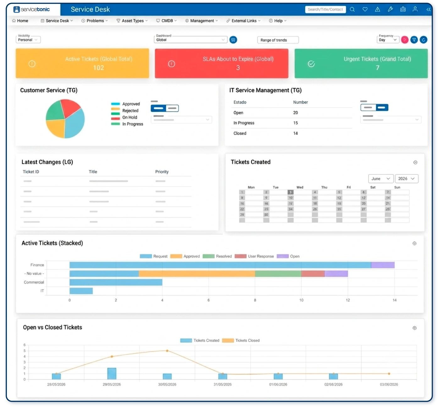
In addition to support-related data, it can also include information about assets and configuration items registered in the CMDB, such as equipment undergoing repair, contracts approaching renewal, or pending preventive maintenance tasks.
Ticket and Support Indicators
These indicators provide an overview of service status and help quickly identify backlogs, delays, or workload imbalances. They can be organized by agent, team, priority, status, category, or any other criteria defined in the system.
Asset and CMDB Indicators
Dashboards can also be used to monitor assets and configuration items. This makes it easier to track repairs, renewals, maintenance tasks, and other activities related to infrastructure management.
How a Dashboard Is Structured
A dashboard is made up of different layers that organize information clearly. The complete view brings together several panels, and each panel displays one or more indicators according to the defined criteria.
This structure makes it possible to tailor the information to each service, team, or manager without displaying all the data in a single view.
Dashboard
The dashboard is the overall view that groups together information for a service or area. Each department can have several dashboards according to its needs, such as one for support tickets, another for assets and the CMDB, and another for SLA monitoring.
Panels
Panels are the visual blocks that make up the dashboard. Each one can display information in a different format, such as a list, calendar, table, chart, or total indicator.
Elements and Indicators
Elements are the data that feed each panel. To configure them, it is necessary to define the criteria that the tickets or assets displayed must meet, such as status, priority, assigned agent, category, service, or date.
Thanks to this structure, a single dashboard can combine different panels and indicators to provide a comprehensive view tailored to each user’s objectives.
Dashboard Visibility Levels
Not all users need access to the same information. For this reason, dashboards can be configured with different visibility levels depending on the user’s role, team, or scope of service.
Personal View
The personal view displays only the tickets, tasks, and indicators related to the user who is currently logged in. It is useful for helping each agent monitor their activity, priorities, and workload.
Team View
The team view provides access to information about all members of a support group. It makes it easier to compare workloads, identify imbalances, and coordinate daily work more effectively.
Service View
The service view provides an overall view of all tickets, agents, and indicators associated with a specific service. It is particularly useful for managers who need to monitor performance, volume, and SLA compliance.
Global View
The global view brings together information from several services or areas in a single dashboard. It makes it possible to compare results, identify general trends, and obtain a broader overview of operations.
Different panels and views can be configured within each visibility level depending on the monitoring objective. For example, one view may focus on support, another on assets and the CMDB, and another on problem management or SLA compliance.
Types of Dashboard Panels
Dashboards can combine different types of panels depending on the information to be displayed and how it should be interpreted. Choosing the right format helps present data clearly and supports faster decision-making.
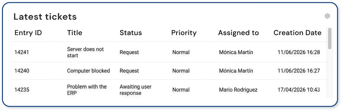
List Panel
Displays tickets in a list format. It is useful for reviewing specific requests and checking their status, priority, assigned agent, or expected resolution date.
Calendar Panel
Displays tickets according to the selected date field, such as opening date, due date, or scheduled date. It helps identify workload peaks, pending tasks, and periods with higher activity.
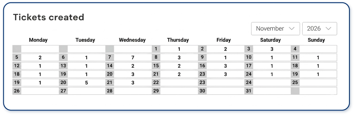
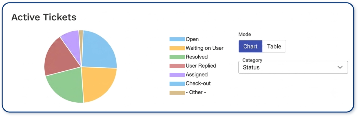
Table or Chart Panel
Displays data in a table or chart depending on the type of analysis required. Tables make it easier to consult specific values, while charts allow users to visually compare percentages, categories, priorities, agents, or ticket statuses.
Totals Panel
Displays the total number of tickets that meet a specific condition. Colors can be used to indicate whether a value is within the established limits, approaching them, or above the defined threshold.

Trends Panel
Shows how an indicator evolves over time. It can be configured using line, bar, or area charts to identify increases, decreases, or recurring patterns.

Stacked Panel
Makes it possible to compare several variables within the same visualization. For example, it can show the distribution of tickets by agent and priority, or by service and status.

How to Configure a Dashboard Based on Its Purpose
Dashboard configuration should begin with a specific question: what does the user need to monitor, and what decisions must they make using that information? Not all dashboards should display the same data or use the same types of panels.
Dashboard for Support Tickets
It can be configured to display open, pending, urgent, unassigned, or soon-to-expire tickets. It can also include filters by agent, team, priority, category, or status.
This type of dashboard is useful for monitoring daily activity and quickly identifying requests that require attention.
Dashboard for Assets and the CMDB
It can display information related to assets and configuration items, such as equipment undergoing repair, contracts approaching renewal, or pending preventive maintenance.
Its purpose is to support operational monitoring and help teams anticipate actions involving assets before incidents or deadlines arise.
Dashboard for Monitoring SLAs
It can include tickets that are close to breaching response or resolution times, compliance levels by service, and alerts linked to specific thresholds.
This type of view supports service level agreement (SLA) management by helping teams identify risks of non-compliance and take action before the agreed time limits are exceeded.
Dashboard for Workload Distribution
It can also be configured to compare agent workloads, identify capacity issues, and redistribute tickets according to volume, priority, or available capacity.
How to Customize Dashboards Without Coding
Each team needs to view different information depending on its role, objectives, and the service it manages. For this reason, Help Desk software should make it easy to adapt dashboards to personal, team, or service views.
With ServiceTonic, users can configure indicators, filters, display formats, thresholds, alerts, refresh frequency, and visibility levels without coding. This enables each user to have a dashboard tailored to their KPIs and the information they need to make decisions.
Benefits of Customizing Dashboards
Customization allows each user to view only the information relevant to their work. An agent can focus on pending tickets and individual KPIs, while a manager can monitor team workload, SLA compliance, and the overall performance of the service.
Because dashboards are highly configurable and require no coding, they can be adapted to the KPIs, responsibilities, and needs of each service.
Their main benefits include:
- Greater clarity: avoids displaying unnecessary data and makes information easier to interpret.
- Personalized KPI monitoring: each agent, team, or manager can view the indicators related to their objectives.
- Better adaptation to each service: different metrics can be configured according to the needs of each department or organization.
- Faster decision-making: makes it easier to identify incidents, deviations, priorities, and risks.
- Higher productivity: reduces the time spent locating data or preparing reports manually.
- More accurate monitoring: supports closer control of tickets, assets, SLAs, workload, and trends.
- Greater preventive capacity: helps anticipate delays, deadlines, backlogs, and potential breaches.
- Scalability: panels can be modified as the organization’s services, teams, and objectives evolve.
Overall, customization turns the dashboard into a management tool adapted to the real operational needs of each team.
It also makes it possible to create dashboards for distributing workload, identifying imbalances between agents, and taking action before they affect service performance.
Common Mistakes When Configuring a Dashboard
A dashboard can become less useful if it is configured without a clear objective or displays too much information. Some of the most common mistakes include:
- Including too many indicators: displaying excessive amounts of data makes it harder to identify which information requires attention.
- Failing to adapt the view to the user: an agent, a team manager, and a director need different types of panels.
- Choosing the wrong panel type: not all data is interpreted equally well in a list, chart, calendar, or total indicator.
- Failing to define thresholds and alerts: without reference values, it is more difficult to identify deviations or risks.
- Using outdated data: a dashboard should reflect the current state of the service.
- Creating panels without a specific purpose: each dashboard should answer a particular question or management need.
- Failing to review the configuration over time: indicators should be adjusted when processes, teams, or objectives change.
- Failing to act on alerts: identifying a problem provides little value if no action is taken afterwards.
To avoid these mistakes, each dashboard should be designed around the user’s actual needs, include only the most relevant indicators, and be reviewed regularly to ensure that the information remains useful.
Custom ServiceTonic Dashboards
ServiceTonic makes it possible to combine different types of panels, indicators, filters, and visibility levels to create dashboards tailored to each service, team, or manager, without the need for coding.
Discover all the possibilities offered by ServiceTonic’s customizable dashboards.
Frequently Asked Questions
What Types of Panels Can a Dashboard Include?
It can include panels in the form of lists, calendars, tables, charts, totals, trends, or stacked charts. Each format is better suited to a particular type of information and analysis objective.
What Is the Difference Between a Panel and a Dashboard?
The dashboard is the complete view. Panels are the individual visual blocks that make up the dashboard and display specific information through charts, lists, tables, or indicators.
Can Different Views Be Created for Each Agent or Service?
Yes. Dashboards can be configured with personal, team, service, or global visibility, allowing each user to view only the information relevant to their role.
Can Dashboards Be Configured Without Coding?
Yes. ServiceTonic allows users to configure panels, filters, metrics, alerts, and visibility levels without coding, adapting each dashboard to the needs of the team.
Conclusion
A useful dashboard should not display all available information, but rather the right information for each user and objective. Choosing the appropriate indicators, panel type, and visibility level makes it possible to turn service data into a practical tool for monitoring and decision-making.
When dashboards are adapted to the organization’s actual processes, it becomes easier to monitor tickets, SLA compliance, assets, workload, and trends without relying on manual reports or generic views.
Request a ServiceTonic demo and discover how to configure dashboards tailored to each service.